BREAKNECK
A Mag for the
Chronically Online


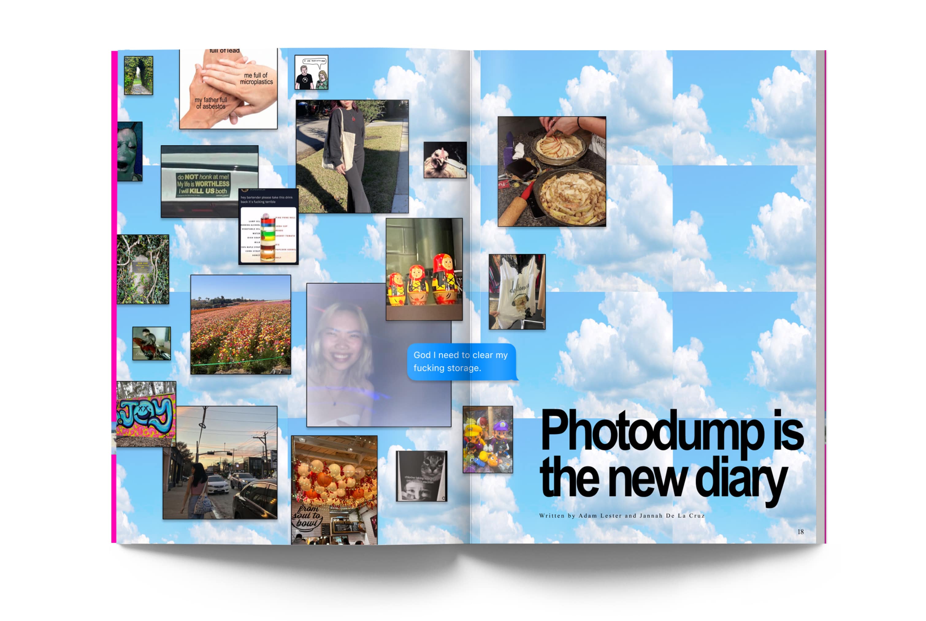
Breakneck is a magazine made by and for Gen Z. This magazine serves as a reprieve from a world that is moving at a turbulent, break-neck pace. Like its target audience, Breakneck aims to defy cultural, social and societal norms.
Print publication
Quirky, rebellious, weird, hip
Sean Bacon, Bradford Prairie
April 2025


This magazine employs a variety of classic and "overused" fonts as a callback to the early internet. Times New Roman and Arial is the brand's mainstay. Columns and grids are merely a suggestion, the content flows wherever it pleases. Gratuitous use of Arial and Times New Roman, bad kerning, and unflattering colors-- Breakneck uses it all.


